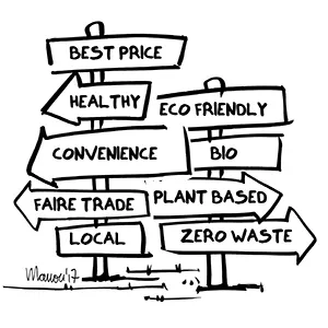
How they influence purchase behaviour in physical retail? The types of in-store communication explained
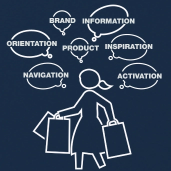
As a store visitor pushes his or her shopping cart through a shop, he or she searches for relevant and readily available communication to decide which departments to visit, which article to research and purchase. An overwhelming number of messages are trying to trigger his or her over-stimulated brain.
Shopper marketing recognizes that shopping public is an audience. Getting shopper communication right is tricky. But when it works it can be brilliantly effective; connecting with shoppers right at the point of purchase.
"Attention is focused mental engagement on a particular item of information. Items come into our awareness, we attend to a particular item, and then we decide whether to act.", Thomas Davenport & John Beck, The Attention Economy: Understanding the New Currency of Business / 2001 (wiki).
In this article we look at 7 types of in-store communication that a shopper comes across before actually deciding to purchase. Because the majority of decisions are influenced by emotions, the most effective in-store messaging appeal to the heart.
Pilotes specializes in the design of commercial furniture, display and merchandising solutions. We offer 100% customized point-of-purchase materials tailored to the in-store projects of brand and retail. Because we care about the climate and environment, we analyze the lifecycle of each project to avoid, reduce, and offset its impact 🌍🌿
Do you have a project planned? Contact us and let’s bring your vision to life together!
1. The walk-the-aisles moment
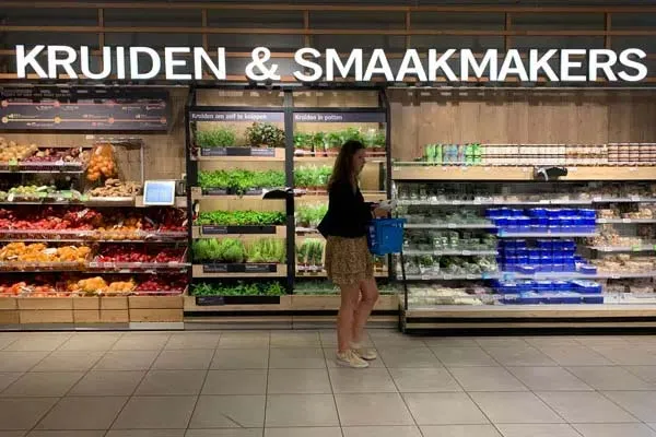
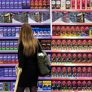
The visitor is often in a hurry looking for specific offering. The vast majority of shopping journeys are spent to walking and navigation. Given the large number of references in a shop, it can be difficult for the customers to find what they desire, especially in supermarkets with 10.000's of items.
Signage and navigational aids positioned throughout the shop ensure that customers find the offer that meet their needs. These messages should be short, simple, direct, readable in just a few seconds, easy to digest for the shopping brain.
2. Products sell products
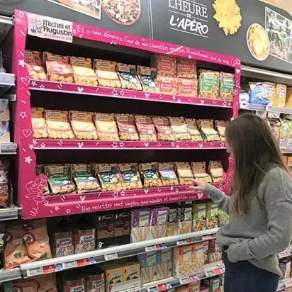
The focus of the browser-shopper is always on the physical product.
Product display or merchandising makes an offering "pop" and connects what the shopper has in mind with what is physically available in-store. Also, when shoppers are just browsing, the best display activates impulsive or latent desires.
To win at this game, ask yourself one question: how findable is an item in less than 10 seconds?
“Stores must be self-explanatory, since signage isn't used until visitors can't find something." — Katelijn Quartier, 10 Myths of Retail Design / Euroshop 2023
3. Analysis paralysis kills purchase
Once customers have decided to examine a larger assortment, brands and retailers can help them direct choice. A challenge!
Consumers craves freedom and variety, but when they shop, they have trouble managing choice. Chances are that they get confused and don't purchase a thing, afraid of making an imperfect decision or lacking confidence in the correctness of a purchasing decision (consumer confusion).
MHD's Whiskythèque, made by Pilotes, helps you find your premium Whisky in 30sec
Arrangement and merchandising tactics influence how choice is made. As a result, the customer experiences a higher level of communication, expertise and service, and tends to remain loyal to the shop or the assortment.
4. Dear brand, try not to tell too much!
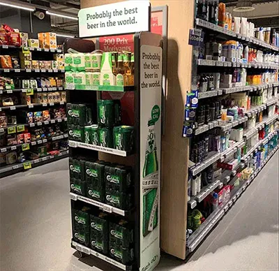
Making brand communication stand out in-store is challenging. While rushing through the shop, the visitor gives a brand not more than a quick glance. What values does the brand stand for? How does it appeal to its target audience? A brand may have a brilliant story to tell, but it's irrelevant if the customer doesn't see it.
So how can brand communication stand out on the shop floor? Remarkable shapes, graphics or original materials can catch shopper's eyes. Or they can add service to facilitate a memorable purchase experience (tip!).
Creativity, originality and consistency are essential to deliver a quick message. In other words, the customer does not have to make an effort to understand and remember the message.
“The average shopper only reads 15 words," — Toby Desforges - engage
Telling too much is probably the biggest slip up, the visitor is already gone before the end of the story.
“Brand advertising on the shelf will not work in most cases. The shopper is interested in solving a purchasing problem, finding the right product, and proceeding with shopping, not in hearing how your brand is great or watching your TV commercial." — Mike Anthony - Shopper Marketing Expert
5. Informational communication: keep it simple!

Shopper wants to know what a product does for them. Or, what makes it special? How and when consumers can use or consume them? Or how can they make the most of it?
Informational communication about features can make the purchase experience easier. To be understood, make it short. Your customer barely wants to read anything; you can better visualize what you want to say.
6. "I need ideas!" Be there and be useful
Sometimes shoppers don't know what they are looking for. If during a shopping trip inspiration is lacking, in-store communication can fill the gap. These moments can take different forms. A few examples:
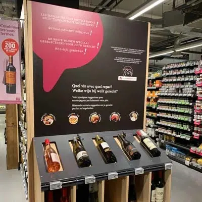
- merchandising tactics that invite the shopper to touch products
- "wow!" display and visual cues of how consumers feel
- inspire moments of consumption (aperitif moments are hot today)
- videos on how to prepare a dish
- cross-merchandising material that brings together complementary products
- touchscreens with fast, interactive bots
- soothing music or the smell of freshly baked bread
- sampling, tasting or cooking demonstrations that make mouths water
- advice from shop employees
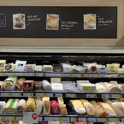
The better the communication appeals to the senses, the faster it get the imagination of the customer running. Inspirational communication work in just about any shop environment. They are not only an excellent way to remedy a lack of ideas, but also to tempt prospects into a store or a department.
7. Dear shopper, do something! (before the next message hits you)
Call-to-action encourages shopper immediate responses – grab a product and examine it, try it, ask for information, read the brochure, take advantage of the discount today, purchase now (because limited stocks available)!
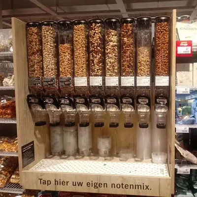
Remember that attention (and motivation) is rapid and transitory. Make it easy for the shopper to act, ideally to purchase, ... everything has to be super user-friendly!
Key takeaways
In-store communication should be simple, clear and easy to digest for the shopping brain. Its about location, merchandising, signage, graphic, price at two touch points and presented on heart level! Is this experience? Yes, it shows convenience, problem solving, suggests diner tonight and that fresh is healthy for us, and it feels good at the same time.
Shopper communication marketers are aware that the physical shop is an attractive venue for reaching consumers. In-store communication need careful planning based on a clear understanding of who the target shopper is, his or her shopping behaviour, and how (and where) he or she can best be influenced.
Date: Sept 2020 — bh
Have the advantages of in-store communication aroused your interest? Reach out today, we will gladly ideate for your product.

