Visual Merchandising: the Whisperer of Temptation to Drive Sales in Retail
900 words
#marketing #merchandising #POP
June 2024 — bh
@Pilotes PLV
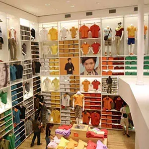
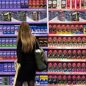
Visual merchandising refers to the initiatives retail and brands take to drive sales in stores. This includes planning assortment, arranging products, organizing and presenting to drive awareness and differentiation, as well as the design and installation of POP or display materials and the maintenance and restocking of shelves.
Nothing is left to chance in the competitive retail arena, where shoppers have increasingly high expectations. Retailers and brands that present their products in an orderly and logical manner, without creating confusion, attract more customers who are likely to become repeat buyers.
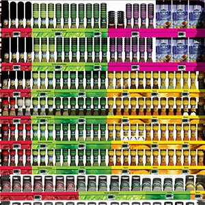
And as the number of items on shelves grows, effective merchandising becomes ever more critical. If a shopper doesn't see a product, they won't buy it. Moreover, as customers tend to spend less time making purchasing decisions, merchandising must quickly provide a clear understanding of a store's offerings.
Focusing on product presentation in supermarkets and specialty stores, let's review some of the basic merchandising tactics.
Pilotes specializes in the design of commercial furniture, displays, and merchandising solutions for retail and stores. We offer 100% customized point-of-purchase materials tailored to the in-store projects of brand and retail. Because we care about the climate and environment, we analyze the lifecycle of each project to avoid, reduce, and offset its impact 🌍🌿
Do you have a project planned? Contact us and let’s bring your vision to life together!
1. Product visibility
 When
customers can't see, discover, or locate a product, it's likely to gather dust on the shelf. Visibility
is crucial for sales, especially for impulse or subconscious purchasing behavior.
Items placed at eye and hand level (120 cm - 170 cm) receive the most attention and generate higher profit margins. Lower shelves (90 cm - 120 cm) accommodate products with lower margins, while the lowest levels (under 90 cm) are less convenient for shoppers — bending down to pick up items is always a pain.
An inclined shelf with a high edge significantly boosts visibility for items displayed at higher levels. However, shoppers typically ignore any item above 180 cm unless searching for it.
The horizontal distance to the end of the shelving, where the so-called 'racetrack' is, also affects sales. The racetrack, or 'fast track', is the wide aisle at the back and middle of the supermarket, where consumers switch aisles. Here you find the strongest products that can draw visitors into the aisle and seduce them to buy from the category
In short, finding the optimal shelf layout (planogram) remains a complex challenge due to the diversity of products.
Discover more > The railway to your ideal product presentation material: the planogram explained2. Grab 'n Go
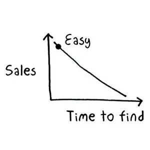
 Enhancing shopper convenience is crucial for driving sales. The ease with which shoppers can get their
hands on a product, as an act of buying or to further evaluate, is probably the most important concern
of any self-service stores.
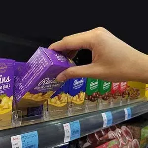
Maintaining fully stocked shelves, with products faced up on the shelf edge, is essential for shoppers to quickly find what they want, and minimize the need for staff intervention.
Various merchandising solutions, such as divider and pusher systems, gravity shelves or product trays ensure attractive display and facilitate easy product selection, reducing the time spent restocking or facing up products on shelf.
Discover more > Retail shelf merchandising techniques and equipment: solutions and hacks3. Product understanding, a clear and cohesive image
 While
some customers may have more time to shop, to understand the variety and niche products, they still
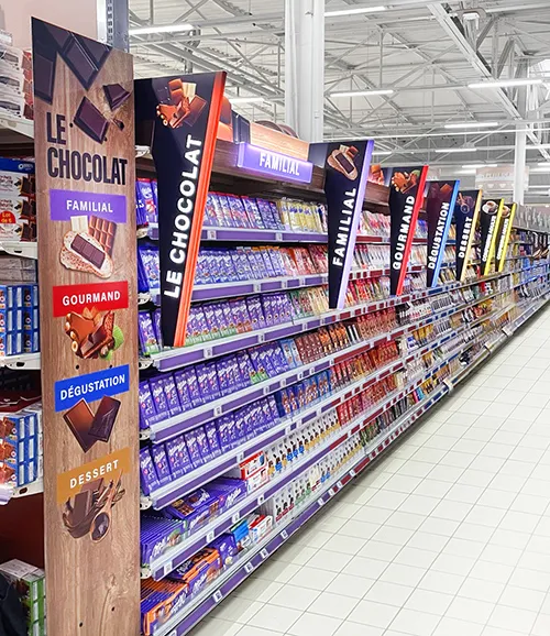
prioritize efficiency. To guide shoppers effectively, use communication tactics such as segmentation,
signage, cards, glorifiers, or digital screens with contrasting colors and simple language that
influence purchase decisions.
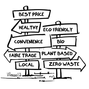
And while choice can be welcomed, overwhelming customers with options often decreases sales. Presenting a well-organized selection helps customers navigate choices effectively. Brands and retailers play a proactive role in shaping choice architecture. They distill the initial impact of an offering to a single key message. Consequently, shoppers experience a high level of product knowledge, value the service, and tend to remain loyal.
Remember, shoppers allocate only a few seconds of cognitive attention per product, so avoid clutter and focus on clarity to optimize conversion rates.
Discover more > The railway to your ideal product presentation material: the planogram explained4. Get creative
 While
the product remains central, compelling brand storytelling enhances consumer engagement. Reflecting
brand personality through visual aesthetics — colors, shapes, and ambiance — enriches the shopping
experience.
Material choice also influences perceived value and authenticity. For instance, wood conveys quality but may suggest higher pricing, impacting consumer perceptions.
Considering shopper preferences, designs that prioritize safety and comfort—such as avoiding sharp edges—enhance consumer interaction with merchandise.
Discover more > How to choose the right material for your retail display Discover more > The role of color in POP display5. 100% customization
 Effective
merchandising hinges on tailoring solutions to specific contexts and consumer behaviors. Customized
displays facilitate intuitive interaction and strengthen engagement across diverse product categories.
In industries like cosmetics, where the consumer experience is intimate, merchandising becomes a crucial tool for fostering brand image and customer loyalty.
Discover more > Beauty retail: POP display elevates the shopping experience6. Cross-sell and up-sell
 Another
great tip for enhancing visibility and sales is by grouping items for cross-selling or up-selling.
Strategic grouping of complementary products encourages additional purchases, enhancing visibility and
overall sales dynamics.
7. Displaying price
This one seems obvious but is sometimes forgotten. What do you think when you evaluating an item without a price tag? Probably that it is expensive.
Clearly displayed pricing avoids customer assumptions of high costs, reinforcing transparency and trust in the offerings.
8. Make the first impression count
Effective display sparks the 1st "wow!" between consumers and products. Make your offering look GOOD. Make sure your presentation is creative, unique, well-executed, and always clean and tidy. Obvious, yes, but this is much more important than you might think! Faded posters, outdated advertisements, sloppy-looking or defective shelves are detrimental; they attract no one!
Are you intrigued by the benefits of visual merchandising in supermarkets and specialty stores? Reach out today to explore how we can enhance your product or brand presence in stores.
