The railway to your ideal product presentation material: The planogram explained
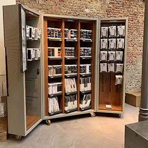
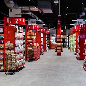
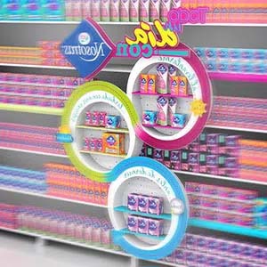
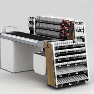
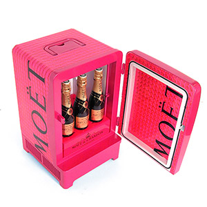
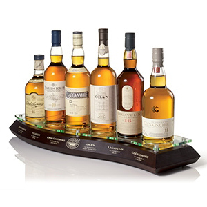
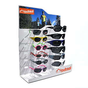
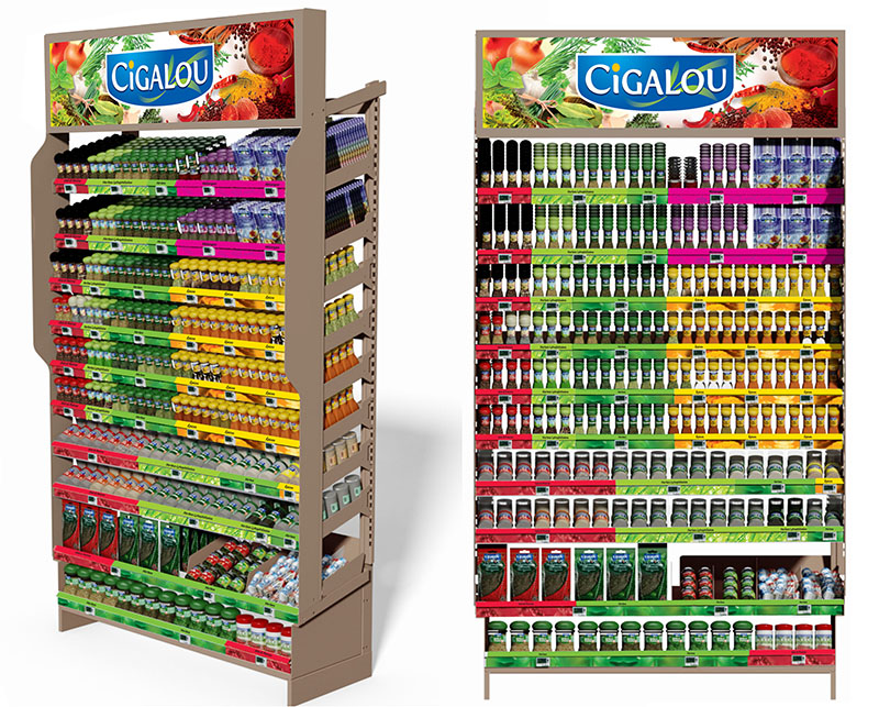
Brand manufacturers that offer larger ranges can develop specific shelving or display materials to help their retail clients to sell better and more. POP manufacturers design these product presentation solutions 100%-custom-made. Unique, attention-grabbing, dynamic, adapted to product, context and brand image; the POP designer's imagination is the only limitation. But every relevant display project starts with an assortment analysis. In short: which item goes where and in what quantity? Let's look at the most important tool that contributes to optimal product organization: the planogram.
1300 words — bh
#planogram #merchandising #marketing #POP
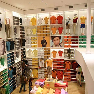
One of the most important vectors of successful retail spaces and display materials is the impact that the product organization, or merchandising, has on buyers, a subtle game of temptation. Therefore, every detail of the product placement is considered, and consulted between stakeholders: store managers, sales team, trade marketing, and merchandising specialists.
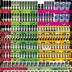
The planogram (shelf layout or POG) is the final piece of the assortment analysis. It is a detailed diagrams of the most favorable placement of items on the shelves of a racks or a display material.
The main purpose of this exercise is to efficiently organize (limited) retail space, adapt the experience to the latest insights about how customers shop from a category, and increase the profitability of a store, a category, or a display material. Planograms are also used to ensure consistency across retail company locations.
Specializing in the design of commercial furniture, displays, and merchandising solutions intended for retail and stores, Pilotes offers 100% customized point-of-purchase materials tailored to the in-store projects of brands and retailers. Because we care about the climate and environment, we analyze the lifecycle of each project to avoid, reduce, and offset its impact 🌍🌿
Do you have a project planned? Contact us and let’s bring your vision to life together!
The product library
Planogram designers begin by compiling a product library: item codes, packaging forms, dimensions in millimeters and possibly product shots to increase the readability of the plan. Sales data can eventually be added.
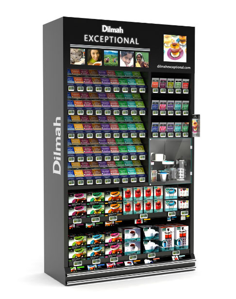
Then the forms are placed on a diagram according to the net height, width, and depth of the shelves of the racks or display material. Possibly all kinds of shelf accessories are taken into consideration that can increase product stability, such as dividers, pushers, or trays,
The readability of a planogram
Space allocation for a display material can remain straightforward, but it is still an essential step that is best drawn out. Your display builder will use your planogram to design the ideal display.
For retail businesses, some of which sell several 10 000 items, spread across several dozen departments, the visual analysis is a stiff challenge. Given the implications, legibility cannot be underestimated, especially since in retail many decisions are made empirically, based on observation, experience, and negotiation.
Specialized hi-tech companies have developed 3D-software with Virtual Reality capabilities that can be tested on sample audiences. The VR sets can record eye movements and focus and measure the efficiency of the project against its objectives.
The facing, the unit of the store shelf

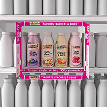
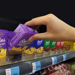
Each shape represents one facing, i.e. one position of a reference, or an individual product visible to store visitors. A product can be given more facings on the planogram to increase shelf stock.
Indeed, the same product reference can be displayed side by side for a variety of reasons:
- shoppers perceive products with more facings as more important
- the product or the brand is an anchor; higher visibility helps buyers find the category
- the product offers the best quality or contributes to the retailer's differentiation strategy
- the product contributes more to profit
- the logistical aspects of the shelf are perhaps the most important considerations: the product rotates quickly, and one wants to avoid out-of-stock, by far the principal irritation for any client
- and finally, order units play a role, i.e. the number of items per box delivered to the store that should best go directly on the shelf
In this context, it may be important to know the shelf elasticity of a product. Elasticity refers to the degree to which demand increases or decreases in response to a change. Shelf elasticity measures the extent to which demand increases or decreases as a product occupies shelf space.
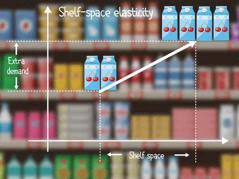
Given the high number of references of similar products, the visibility of an item on the shelf is not guaranteed. If a product gains more shelf share, it is extra-visible; thus, customers are more likely to see it.
Retail scientists have been studying shelf elasticity since the 1960s, sometimes with unambiguous, sometimes with divergent conclusions. A recent meta-study estimates shelf elasticity at 1.17 to 1.20, depending on product, category, location, and store formula.
In other words, if the number of facings for a product doubles, demand will increase by an average of 17 to 20%, with a stronger increase for impulse-sensitive items.
The ergonomics of the act of buying
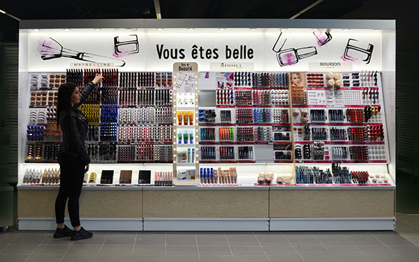
Items located on the top shelves typically receive more attention than those on the lower shelves. The height between 120 cm to 170 cm are the ideal for the most important products - they sell best. Although other interests may have a priority, retail companies prefer to reserve these positions for the best-selling items or those with the highest profit margins.
The shelves below and above eye level are reserved for items that contribute less. Unless they are looking for them, customers barely see them. Products below knee height (90 cm and below) sell much less - bending down to pick up items is always a hassle.
The same goes for the left-to-right line-up for Western consumers, who are strongly right oriented.
And finally, physical strain is taken into account with regard to lifting and putting products on the shelves, both for buyers and staff.
Plan communication too
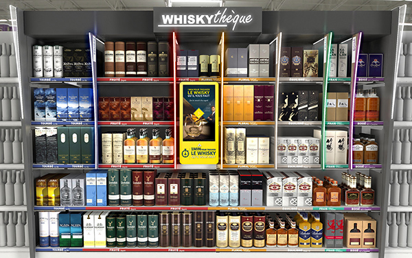
Every display is ultimately an instore communication vehicle. Printed visual materials can convey a message, a sentiment or an mood. Therefore, these areas are also planned. Together with the planogram, they form an overall, preferably recognizable, composition or layout. This is how the overall dimensions of the furniture are finally evaluated, together with the comfort for the buyer.

We can find visual materials at different levels:
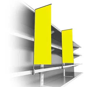
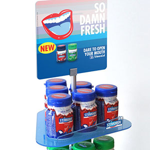
- The top card, show card or front is essentially the central focal point from a greater distance on top of the display. This is also where you will usually find the brand's logo.
- Smaller visual materials can be placed at the shelf level. They create space and are provided with a small sales argument
- Communicating price is the primary function of the shelf edge, or the nose of the shelf. But this space can also be converted into a communication. The strips are provided with assortment information or printing for decoration, information or signage.
Key takeaways
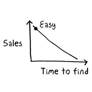
While there is no "one size fits all," there is one important principle: brands and stores that put the right product in the right place sell more. The right arrangement creates visual appeal and value, and thus sales success and profitability. A planogram must be shopper centric: if he or she cannot find a product, it will not sell. That is why merchandising specialists pay close attention to increasing the value of the line-up. With the right organization, they divide the offer into segments, and delineate assortments or categories. All this contributes to the readability of the offer for store visitors, who want to navigate the assortments within seconds, find what they're looking for and be on their way as quickly as possible.
Dec. 2022 — bh
Do you want to improve the attractiveness of your offer in retail shops? We are happy to help you develop your specific shelving and display, always adapted to your context and your brand. Let's talk!
