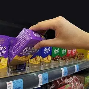
About the aisle of temptation:
Front-end or checkout display drives impulse buying
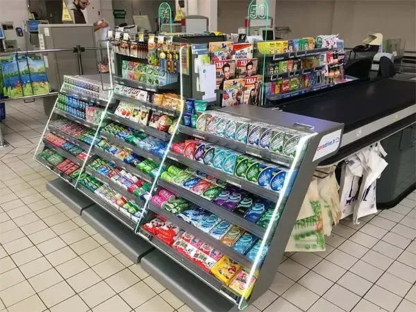
Customers do not want to wait at the checkout, but you already knew that. The feeling of being captivated is always overestimated. Clients perceive it as irritating. And then there’s the worry of dealing with the finances.
The busy queue area is one of the more tactical for any store. Because humans remember better the end of any experience, retail pays a lot of attention to a smooth scenario, also with regard to perception, merchandise and display. It is meant to distract waiting visitors, not to provide the opportunity to compare brands, products and prices.

By the time a shopper arrives at the checkout the number of choices about what to buy (and what not to buy) has drained his self-control. Then he typically has a general feeling of relief: he has finalized his task. Shoppers can be stood for several minutes, waiting to pay.
“Our (shopping) environment determines our (buying) behavior!", behavior expert James Clear, The Candy Trigger. In this article James Clear uses the checkout line as a metaphor for habit management and explains impulse buying.
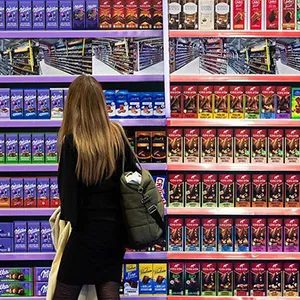
Because he may make a last spontaneous purchase, tempting titbits that rarely make it into the grocery list are set up here in the aisle of temptation — a display of small, affordable items, such as chewing gum, mint, chocolate, pocket confectionery, magazines and soft drinks spark an immediate need and desire for fulfilment when clients see them, even if he weren’t looking for them.
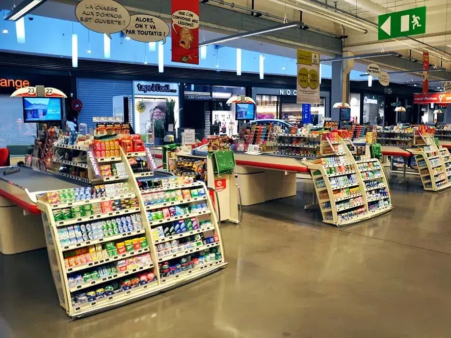 Or
the merchandise ‘reminds’ shoppers of items they may have forgotten to pick up from the main aisles,
such as batteries, lighters, lip stick, hand sanitizer, facial masks, phone/gift cards.
Retailers care a lot about the merchandise in this high-traffic area. Each retail format (supermarket, convenience or specialist stores) can develop its own category-based assortment.
Pilotes makes commercial furniture, display and merchandising solutions. We offer 100% customized point-of-purchase materials tailored to the in-store projects of brand and retail. Because we care about the climate and environment, we analyze the lifecycle of each project to avoid, reduce, and offset its impact 🌍🌿
Do you have a project planned? Contact us and let’s bring your vision to life together!

What is a front-end or checkout display?
A front-end or checkout display is a type of shelved display that is placed in front of the checkout counter, the most important of the fixtures in a store. Any checkout display must distract, catch the attention of waiting consumers and give them the opportunity to open their minds for impulse or latent items to purchase. That is the main advantage of a well-designed checkout display. They require specific design and layout for a number of reasons:
- the diversity of the range
- its ongoing expansion (need for more capacity in the waiting line within the limited surface)
- the need to adapt to changing buying behavior
- changes in store layout, waiting line organization, checkout systems, …
 Retailers set high expectations for these 100% made-to-measure shelves:
- visibility
- perception of quality
- ergonomics
- functionality
- space efficiency
- shelf management for a diverse assortment of smaller (unstable) items that need neat well-organized presentation all-of-the-time.
Only then they can meet their ultimate objectives: drive up-selling, facilitate store operations, comfort and safety for visitors and staff, etc. It is also important that the configurations can be adapted to all shop layouts and counter types.
Case study: Auchan/Mondelez
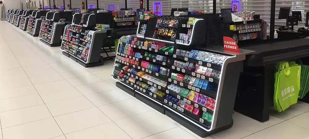
The consumer goods magazine LSA recently published an article on Pilotes’ front-end checkout display concept for hypermarket brand Auchan in collaboration with Mondelez International. The goal for the retailer was to improve the performance for the entire category, and for the manufacturer to develop the market share for chewing gum.
According to Frédéric Archambault, head of impulse and perfect store at Mondelez: “First we worked together to define the assortment and its layout. Some counters featured products that did not fit. Our conversations then focused on optimizing display and attractiveness. At last, we coordinated operations to install 100% of the counters."
RESULTS
+ 15% sales for the checkout category (compared to stores that were not equipped)
+ 3.5% sales for chewing gum at Auchan, while national sales were 4% down
What are the key strengths for this checkout display?
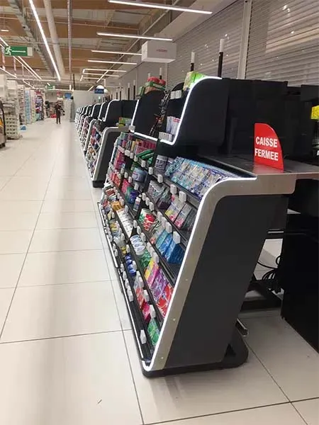
- a perception of quality design with rounded shapes
- a modern and dynamic look
- LED light increases the appeal of the offer
- a comprehensible layout for the entire category
- the shelves are perfectly adapted to the physiognomy, stock and rotation of the items on display
- quality finish & robustness
- integration to all types of conveyor belts for the retailer
A few figures for this operation:
- 120 hypermarkets equipped in 9 months
- 4.000 conveyor belts equipped
- An average of 3 truck loads per hypermarket
- Almost 10,000 pallets send out!
To complete this article, we mention the specific solutions we develop to equip counters:
Front-end unit
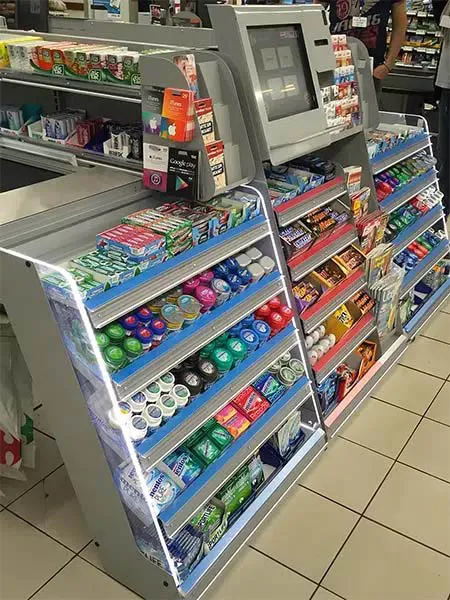 This is the main shelving unit with the highest visibility. Chewing gum is the most common item on
display. It is positioned in front of the conveyor belt. Pilotes maximizes shelf space with gravity
shelves to increase product performance.
Easy-door unit
Pilotes developed a patented door to bridge the gap between two front units. Ergonomic and easy to handle, it creates extra shelving in front of the checkout counter. To increase it’s attractiveness, we integrate extra-visibility shelves.
Side unit
The space along the conveyor belt is a hot zone for impulse buys from a diverse assortment. Pilotes integrates adapted display solutions according to the offer (gift cards, magazines, pocket confectionery, batteries, lighters, lip stick, facial masks, hand sanitizer etc.).
Single-line unit
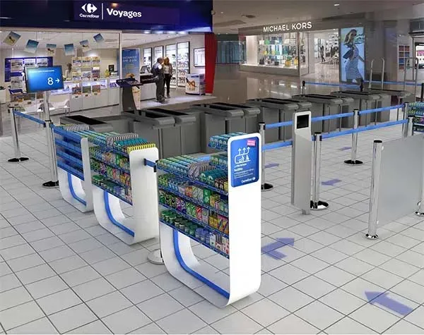 Pilotes
develops display solutions to organize single waiting-line models. These display units present the offer
throughout the waiting time. The shelving units can be single our double-sided to optimize floor space
and maximize product performance.
Self-checkout unit
These space-efficient units create shelving in the self-checkout area. We have developed units that combine product presentation and service functions.
3-sided gondola
These larger freestanding shelving units occupy the space between two counters to distract customers waiting in line with a larger offer, food and non-food.
Date: Jan 2021
Pilotes develops 100% made-to-measure shelving solutions adapted to your assortment and store layout. Our specialist designers and engineers ensure a smooth development and installation. Reach out today to set up a free consultation. We will find the best solution for you.
