The 7 notes for unique POP display material
450 words
#marketing #POP #displaydesign
Aug 2024 — bh
Do, re, mi, fa, sol, la, si: seven notes form the basis of all music. These simple building blocks are combined to create unique melodies that inspire, touch and tell stories.
Instore marketers have a similar goal. They aim to make product offerings stand out in stores, tell stories and touch shoppers.
Like the notes of music, they combine seven building blocks to create distinctive POP displays that are as unique as the products and brand they convey.
Specializing in the design of commercial furniture, displays, and merchandising solutions intended for retail and stores, Pilotes offers 100% customized point-of-purchase materials tailored to the in-store projects of brands and retailers. Because we care about the climate and environment, we analyze the lifecycle of each project to avoid, reduce, and offset its impact 🌍🌿
Do you have a project planned? Contact us and let’s bring your vision to life together!
1. Product presentation
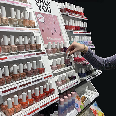
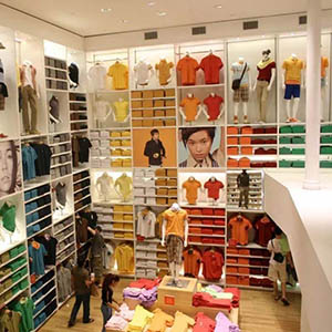
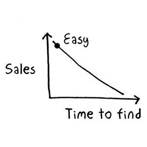
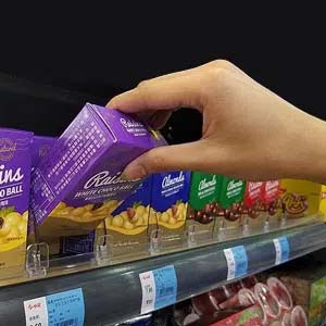
Effective presentations drive sales. Merchandising methods enhance the buying process by dynamically presenting products. They provide a clear layout, making it easy for customers to choose and ensuring accessibility of the offer.
Discover more > Merchandising — the game of seduction in retail2. Design and technical realization
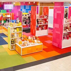
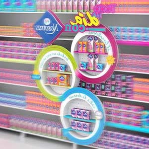
Good design reinforces the message and brand identity. Simultaneously, it optimizes available space. An effective display is visually appealing, functional and well-built.
3. Materials
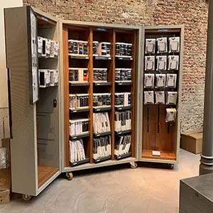
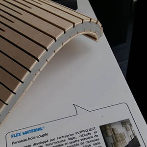
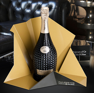
Materials create visual interest and tactile appeal. Wood, metal, plastic, glass, leather, or textiles evoke emotions and reinforce brand identity. Materials should also be functional, considering cost, ease of use, and durability.
Discover more > How to choose the right material for your POP display4. Color
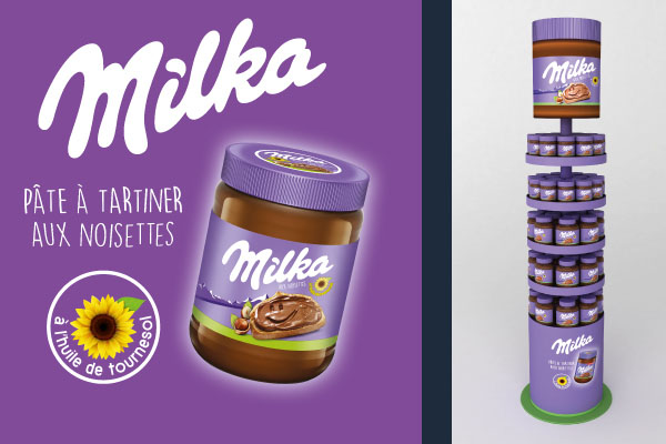
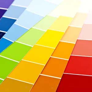
The right color palette creates a coherent image and evokes emotions that influence consumer behaviour. Color enhances the attractiveness of a product offering. Combining suitable colours with appropriate materials elevates the brand promise.
Discover more > POP display colours influence buying behaviour5. Imagery, language, and layout
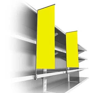
POS materials convey messages and create quick, emotional connections with shoppers. A balanced and recognizable composition of images, language, and graphic assets direct shoppers’ attention to the product. A powerful call-to-action prompts customer engagement.
Discover more > The role of graphics and imagery in POP display6. Location
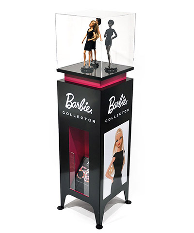
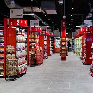
Proper placement of a display is crucial for maximum visibility. Marketers carefully select locations and the most relevant display material type.
Discover more > The types of POP display explained7. Implementation
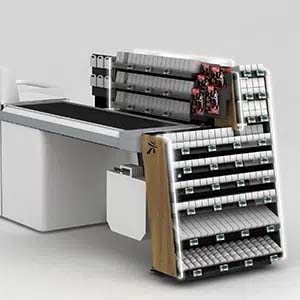
Operational considerations—planning, transportation, installation, and maintenance—are essential for successful displays. Early planning ensures the most suitable material design.
Discover more > Creating the ideal briefing for your POP displayBy effectively combining these seven elements into a unique composition, POP makers create displays that drive sales.
A project? A briefing? Trust our team of professionals for 100% customized solutions. We’re ready to assist you with a practical and operational approach. Contact us today.
