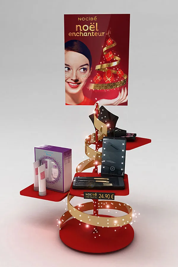
The countertop display:
The most direct product advertisement
Countertop display plays an important role to promote impulse driven brands and products. But how to develop a countertop display material that drives sales? That convinces and leaves a lasting impression? And what are the different types? Inspiration, tips and tricks with examples.
1 500 words
Brand manufacturers are always looking for effective ways to stand out on the counters of stores, to arouse curiosity, enhance reputation, build loyalty, and to sell more. Functional display can play a role to encourage a quick and straightforward purchase. Stocked with merchandise at fingertips, it is a three-dimensional advertisement for itself.
Since many years we have been appointed by brand manufacturers to create and make, among others, countertop display units. We are happy to share some key-takeaways for the most direct product advertisement.

Pilotes makes commercial furniture, display and merchandising solutions. We offer 100% customized point-of-purchase materials tailored to the in-store projects of brand and retail. Because we care about the climate and environment, we analyze the lifecycle of each project to avoid, reduce, and offset its impact 🌍🌿
Do you have a project planned? Contact us and let’s bring your vision to life together!
Counters generate additional sale at the end of shop visits
Most of us don't like shopping, right? We're looking at it as a task-based exercise. During our shopping trip we are flooded with information. What department and categories to visit? What assortments to examine? Sometimes we make decisions in a matter of seconds — the decisions not to buy drain us too.
We want our basket to reflect our values, a balance of what we came in to find and what stimulated our impulses. We have welcomed, or not, the later: serendipity is the shopper’s strongest ally.
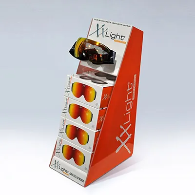
As we walk towards the checkout our self-control is probably exhausted. We experience a general feeling of relief. We have successfully succeeded our visit. Possibly we deserve a reward, right?
The most successful stores know how to transform this mood into an additional sale. On their counters they offer last-minute opportunities for an indulgent, impulse or latent purchase. All kinds of small articles are on display here — potential consequences of a bad buy are negligible.
Sweets, mints, chewing gum, chocolate, gadgets, and soft drinks spark an immediate urge when we see them, even if we weren’t looking for them. Or the merchandise reminds us of articles we have forgotten to pick up, such as batteries, lighters, lipstick, phone, and gift cards.
“In the field of consumer behavior, an impulse purchase is an unplanned decision by a consumer to buy a product or service, made just before a purchase", Wikipedia
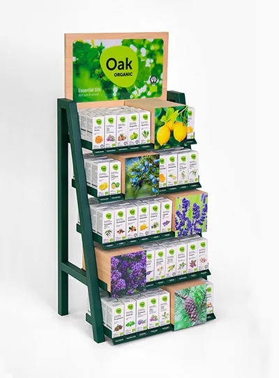
If it reflects its theme, each store can adopt a categorical approach to generate impulse purchases. A pharmacy, for instance, is a destination. We come to fill our prescription. Until that mission is accomplished, we don't notice a single sign or display we pass. And when we've got some time to kill in the waiting line, we won't be distracted by anything else but the pharmacist. No wonder that around him, the offer transforms our gaze into an extra sale. With the right support behind and on the counter, health-and-beauty aids and over-the-counter cures sell themselves.
We refer to other articles on this website for the general tactics to adopt for any display. If the material pops, is distinctive, tailor-made, and reflects brand image, the hard part is done. Let's look here at some of the conditions for this specific location. After all, to be relevant, any display initiative may better be suited to store context and its intended location.
Counters are 1st grade, and everybody wants a seat
Most of us only visit a fraction of a store. But, we all pass through the checkout zone. In the busiest zone, with the highest visibility, we form our last impression of the shop — and we will remember it best. This is why shops pay a lot of attention to the last point of contact with customers, also regarding merchandising.
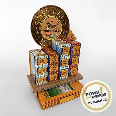
To fully take advantage of the front row, the offering on display better be popular, easy to sell to all the visitors. It’s no secret that some stores are embarrassed by choice. Every day representatives come around with another super-great countertop display to offer. Shops carefully curate the strongest items and brands, that are supported by the best sales devices.
Pull up your socks, this is the toughest battleground in any store, but also the most rewarding. Each display placed brings in.
Counters are tiny, but valuable
When you start designing your display, counters are already jammed with stuff. This selling space has always been in short supply. And the materials better not obstruct the 1st priority: checkout operations by cashiers who greet hurried customers, as they come and go.
The need for space efficiency applies to any display initiative. For counters in particular the balance between footprint, product and image is a real brain-twister. Because shoppers always focus on physical products, it is best to give priority to the experience (or the presentation) of the offer.
Brand manufacturers want larger POP displays, which is understandable considering the relationship between size, consumer comfort, visibility and sales. Store owners, on the other hand, want smaller footprint; to distract waiting clients they want to broaden the check-out category with several items on not too tall devices. To meet the conditions of stores and consumers, displays come in many sizes, but none of them has been so successful that it has become a norm — and so, the game goes on.
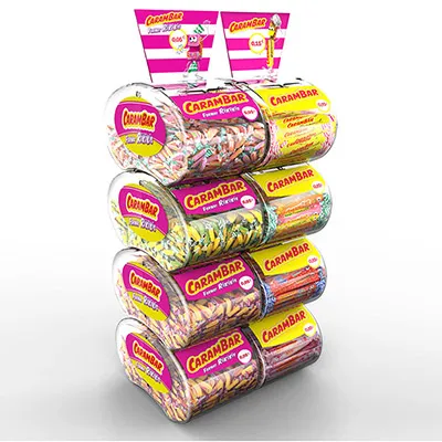
If competition is tough, the location is precious. And all counters are different. Any idea to optimize the space for your products is good to consider. For example, the display can be adapted to the different spaces available. From its early design stage, anticipate modularity in height or width.
However, modular design comes with a cost. And because display materials are polyvalent solutions without limits, it is important to match the solutions to the financial margin they generate. The content of your briefing can advance these condition early in the process.
And remember, an empty display is a dead display. The stock on display better is large enough to last until the next replenishment.
Counters are the formula-1 pitstop, or not
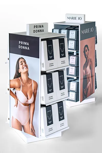
Because it is always busy at the checkout, everything revolves around quick choice. This is not the place for visitors to examine and compare brands. Remember that the aim of the countertop display is to trigger an impulse purchase. It is therefore better to use this type to highlight affordable products that can provoke immediate action. Because simplicity is key, in most cases, triple-A brands put their top sellers on counters.
And what if the opposite is true? The countertop is also a good location to introduce innovations. Shoppers want physical sales surfaces to be interesting, with always something to discover. Specialty outlets can meet those expectations. On the countertop they show enthusiasm for items that are new and exciting, with sales associates nearby for a quick explication or word of advice.
What are the types of countertop display? + examples
The key to effective countertop display? 100% customization, because the solutions are multiple; there are many supports and devices, many variants of display.
Because of their diversity, it is good to know the different types and how they are used. The focus here is on functional display materials that can withstand the the wear-and-tear of the retail environment over a longer period of time (as opposed to cardboard or short-term promotional materials).


