Instore marketing for pharma, health & well-being: The best POP display and product merchandising
Since the pharmacy is the place where healthcare professionals provide impartial advice to patients, advertising remains delicate. Stocked with merchandise at the fingertips of visitors, display materials are powerful three-dimensional advertisements for themselves. They play an role in promoting sales. In this article we take a closer look at the locations that the display solutions can conquer.
5 minutes
#pharma #marketing #POP
May 2022 — bh
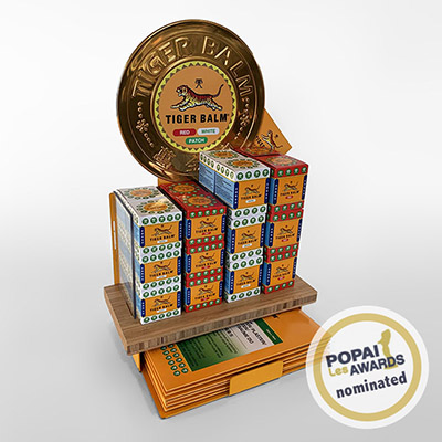
The pharmacy is a special type of point of purchase. Patients go there to get fulfillment of medical prescriptions. It’s an attractive outlet for medical care, the patients are prepared to make the journey. Marketeers call this a destination shop - although most regulations define a pharmacy as a practice, not a shop.
The pharmacy practice has changed rapidly. Most of them have developed an offer to generate additional business. At the same time, they reduce the perception of the biggest irritation of any experience: the waiting. While clients wait in line, lay-out and communications divert attention to pharmaceutical articles to promote health and well-being, such as dermo-cosmetic, oral and dental care and beauty, suncare, natural self-care remedies, vitamins and nutritional supplements, aromatherapy, plant extracts, bandages and plasters, and more.
The increased emphasis on business has come with opportunities for the producers to advertise, a delicate exercise for a place once reserved for prescription medicines where patients seek impartial advice on diseases and conditions. The main objective is to safeguard and reinforce trustworthiness and reliability of the pharmacist.
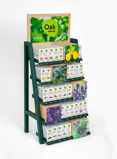
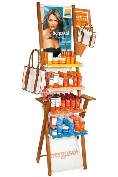
The producers of the parapharmacy are always looking for effective ways to stand out, arouse curiosity, enhance their reputation, showcase their products, and build consumer loyalty. They can use display to this end. Stocked with merchandise at the fingertips of visitors, the materials are powerful three-dimensional advertisements for themselves. They play an important role in promoting sales.
Because these solutions are stand-alone, they promote the dynamic and the interest of the pharmacist’s offer. Consumer place high expectations on every visit. New ideas, know-how, innovations, inspiration on display materials refresh the experience. A win-win for the pharmacist and the pharmaceutical sector.
In this article we take a closer look at the locations that the display solutions can conquer. For many years, various players in the pharmaceutical sector have entrusted us with the design and realization of display materials. We are happy to share our experiences and some key-takeaways for the most direct advertising.
Specializing in the design of commercial furniture, displays, and merchandising solutions intended for retail and stores, Pilotes offers 100% customized point-of-purchase materials tailored to the in-store projects of brands and retailers. Because we care about the climate and environment, we analyze the lifecycle of each project to avoid, reduce, and offset its impact 🌍🌿
Do you have a project planned? Contact us and let’s bring your vision to life together!
1. Optimise the floor space
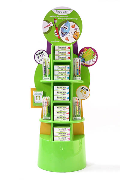
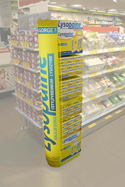
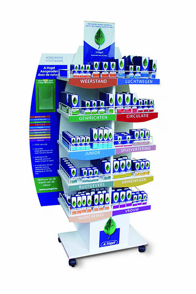
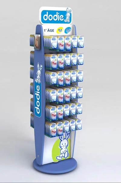
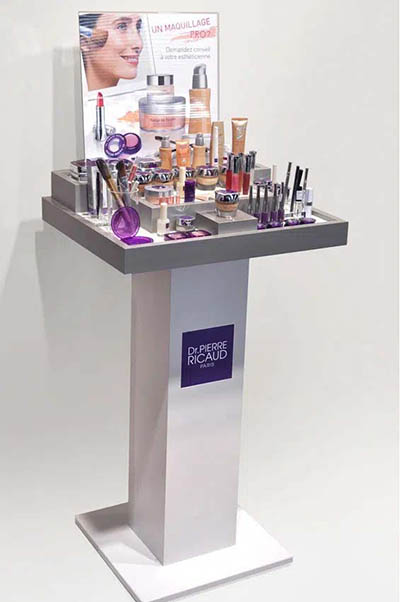
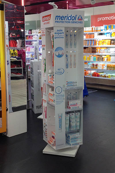
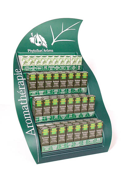
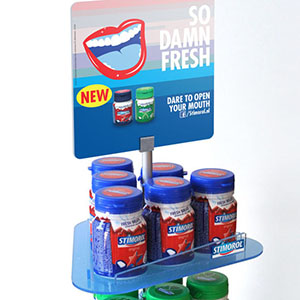
Floor-standing units are the Swiss knife among display materials. Being independent pieces of furniture, their greatest advantage is that they can be 100% made-to-measure. There are various possibilities and methods of making them, in any shape or size, without limits. The makers conceive and adapt display design to the product, as well as to marketing objectives, brand perception, aesthetic, and technical conditions, such as constraints imposed by usage and context.
By arranging the items as cleanly and orderly as possible, a floor-standing display places an offer more tangible and accessible to clients. This is the best way to attract attention and sell more. And because these in-store communications are a contextual form of advertising, the integrity of the pharmacy channel is preserved.
The units can be placed just about anywhere on the floor, preferably in the busiest locations on the pathways. And because the pharmacy is a destination - and patients are highly prioritized, the queue is the busiest location (unless the pharmacist installs a take-a-number queue system).
Most pharmacies are relatively small outlets. The display materials are best designed to be as compact as possible. After all, the pharmacy floor is the battleground of the pharmaceutical sector. The limited space must be conquered with quality, well-thought, and practical solutions.
It can also be a strategy to attract attention after the visitor has fulfilled his priority. On the way out with the prescription medicine under the arm, display can remind him or her of latent needs that are best not forgotten on the next visit.
2. Valorize the practice space
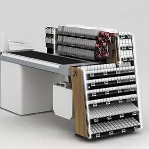
While waiting, patients look most towards the pharmacist himself. The offer around and near him or her can transform these gazes into additional sales. With the right support innovations, impulse or latent articles sell themselves. The offer in this strategic zone fires an immediate need, even if the visitor is not looking for it.
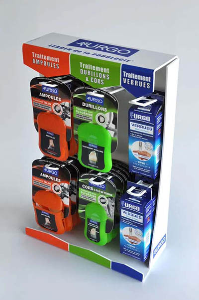
Space optimization is important for any display design. For the pharmacy counter, the harmony between dimensions, product, communication, and brand is a real brainteaser. In any retail space the biggest attraction is the physical product. Therefore, priority is best given to the presentation of the products.
Since clients only look at them for a few seconds, the most successful presentations catch the eye immediately. They are clear, direct, and coherent. That’s the challenge in a nutshell of the counter display in pharmacies.
3. Present elegantly on the shelves
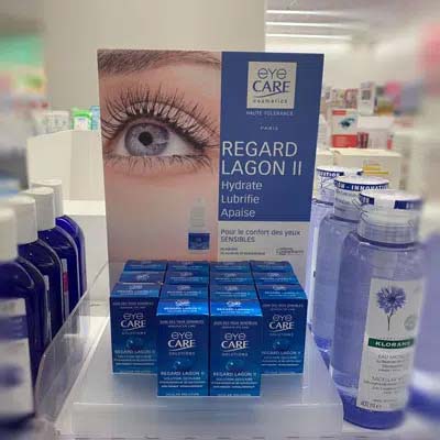
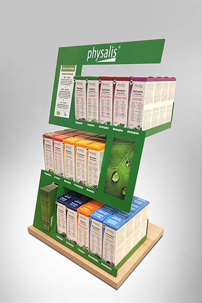
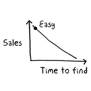
Given the number of items on shelving, the visibility of similar items is not guaranteed. And when clients don’t see a product, they will not buy it, by definition. Display materials can activate an offer on the shelves by making it more visible and tangible. Between two rival products, the customer will not hesitate to choose the one that catches his eye first.
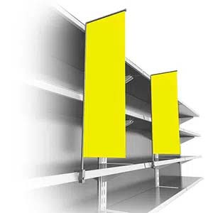
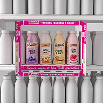
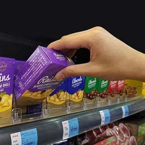
On-shelf display or shelf-on-shelf tools are all kinds of presentation solutions on the shelves. They optimize the allocated space for extra-visibility. Or they add services such as support, line communication, orientation, and lay-out. Plinths, trays, and frames are used to break the visual monotony of the shelves.
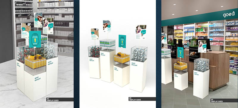
CASE: Generic promotional display for GOED pharmacies
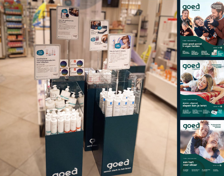
In the GOED pharmacies, patients count on the best advice based on the expertise of healthcare professionals. Early 2021, GOED launches its own magazine, with interviews and testimonials, pratical information, and much more.
GOED also thinks about the cost-conscious consumer. The magazine features excellent offers for the well-being range. At the launch of its magazine, GOED entrusted us with the task of developing a solution to promote the magazine on the pharmacy floor, together with the constantly changing promotions.
As an answer to this challenge, we proposed this set of floor displays. Solidly constructed in metal for a longer life, they are equipped with a transparent box for various articles, and a card- and brochure holder.
These in-store communications reinforce GOED’s price image for cost-conscious visitors. Because of their compact size, they can be used just about anywhere in the pharmacy, and moved near the counter, at the entrance or in the neighbourhood of the category being promoted. GOED also takes care of your wallet!
Do you wish to promote sales for your merchandise in pharmacies? Reach out today to set up a free consultation. We'll find the best solution for your brand.
